

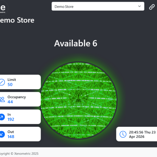
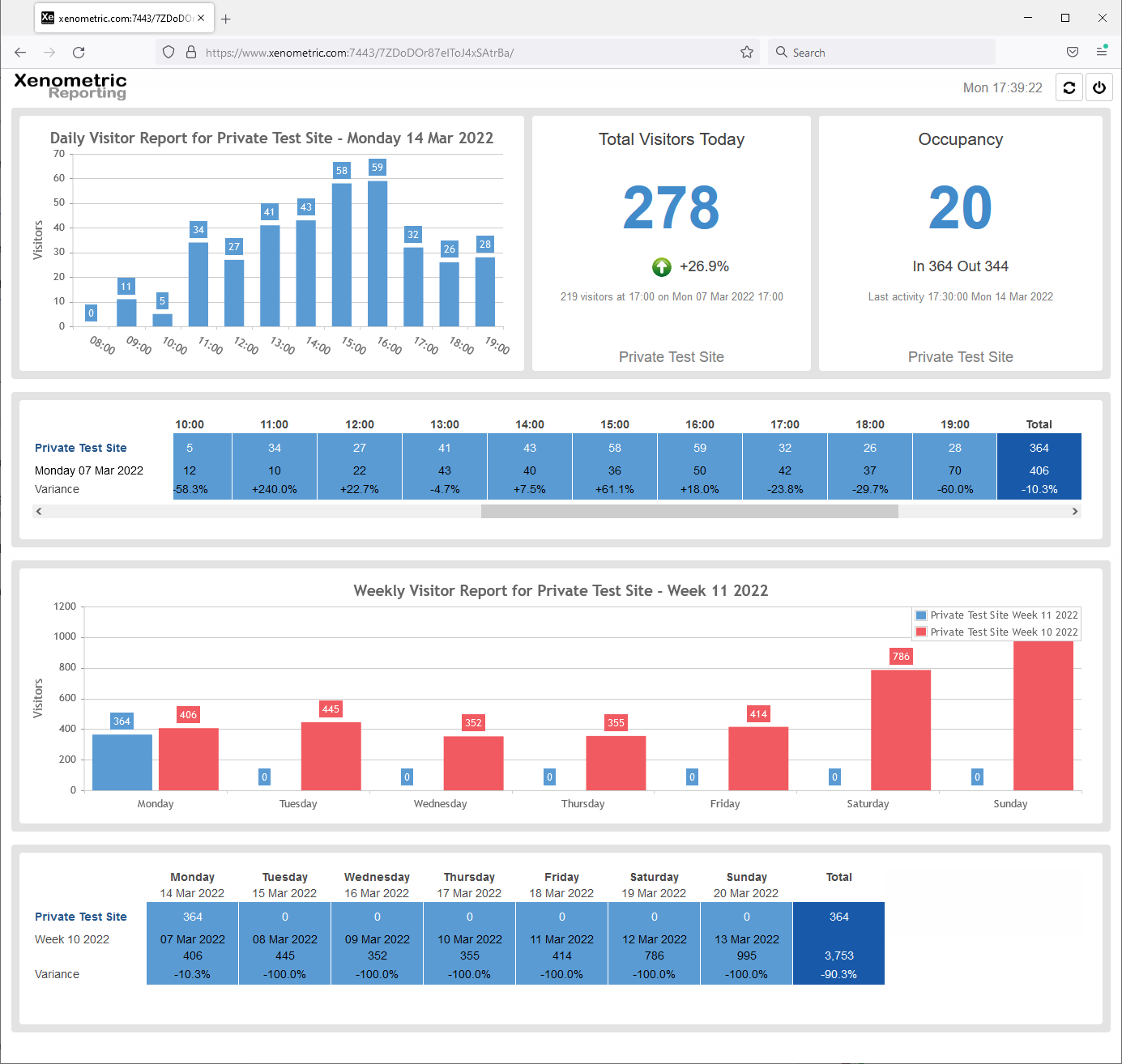
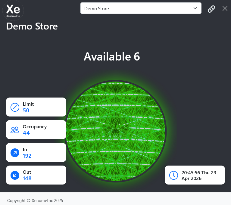
Our HTML5 web reporting now includes a dashboard for visitor counting. The elements on the dashboard will automatically update, so it is […]
View a demo of our reporting at http://www.xenometric.com:7443/?user=demo&pass=demo. This software can be installed on a customer’s server or you can use our cloud […]
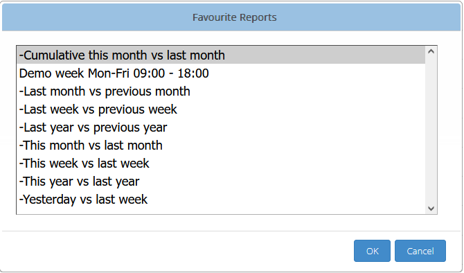
We offer several dashboards that update automatically. We can customise the dashboards to fit the metrics that you wish to display. We […]
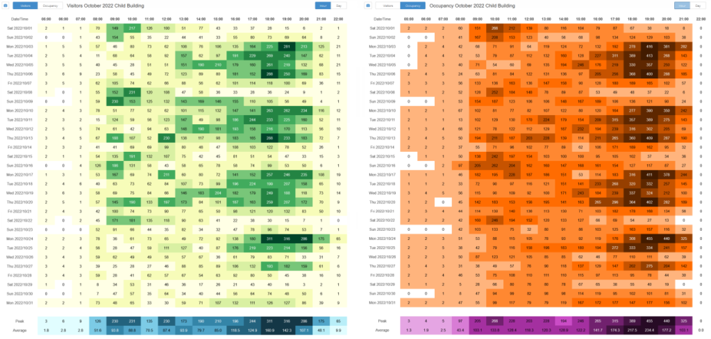
All of your data can now be easily downloaded from within the web reporting software. The Hourly Data button provides a simple […]


